

Getting Traffic but No Sales on Shopify? A Step-by-Step Conversion Diagnosis Guide
Visits but few add-to-carts? Work through landing pages, product pages, trust, mobile speed and checkout in order to find where shoppers leave.

- Published
- 7 Nov 2026
- As of
- 2 Nov 2026
This guide is for new store owners and the developers helping them. It gives you a simple order of checks, so you fix the biggest leak first instead of redesigning everything at once. We lean on Core Web Vitals for the speed checks, and on plain reasoning for the rest.
Start with where visitors land and leave
Before you touch the product page, find out where people actually land. Open your analytics and list the landing pages that get visits, then split that list by traffic source. Paid social, search, email and organic links each bring people with different expectations, so look at each source and landing page pair on its own. A blended average hides the page that is quietly losing everyone.
Then ask a plain question: does the page match the promise that brought the visitor there? If an ad shows a specific product and the link drops people on a general collection, they have to hunt for what they came for. This tends to cause quick exits because people won't dig around when the thing they expected isn't in front of them. The fix is usually simple: send each ad or link to the page that matches its message, and repeat the same wording and imagery you used in the ad.
If you're the developer, check which template those landing pages use. Make sure the main heading, the hero image and the call to action sit above the fold, meaning visible without scrolling, on a phone as well as a desktop. Also check how fast that first view appears. The web.dev guidance on Web Vitals says Largest Contentful Paint should occur within 2.5 seconds of the page starting to load, and a heavy hero image is a common thing that holds it back. Lab tools help here, but the same guidance says they are not a substitute for field measurement, so check real-user data too.
Make the product page answer the buyer's questions
A product page has one job: answer the questions a stranger has before they trust you with their money. Start with clear images, a plain description, the price, delivery information, reviews and an obvious add to cart button. If any of those is missing or buried, the shopper has to go looking, and many simply won't.
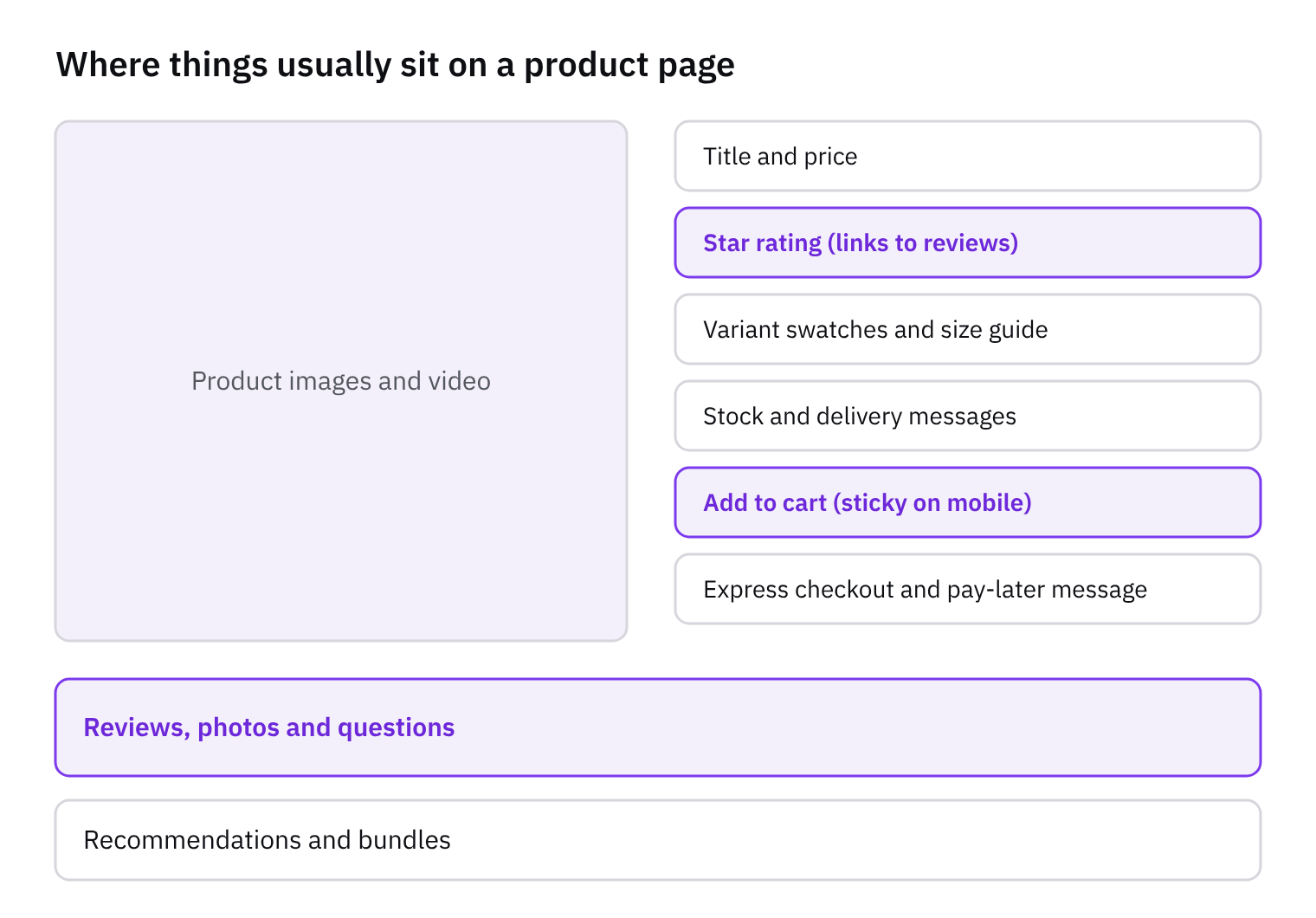
Here's a quick tip. Read your page as a first-time shopper, then list every question it leaves open. Does it say how long delivery takes? What happens if the item doesn't fit? Is the size clear from the photos? Each open question is a reason to hesitate. This tends to help because shoppers add to cart when their doubts are answered right where they are looking, not on a policy page three clicks away. Put delivery information near the price and button, and keep reviews close to the top.
On the build side, make the page easy for the merchant to change without you. In a Liquid theme, use sections and blocks so they can reorder the price, delivery note, reviews and description themselves. In Hydrogen, build the same pieces as components that can be arranged the same way. Keep the page quick too: web.dev's Web Vitals guidance says LCP should occur within 2.5 seconds of when the page first starts loading, and a heavy gallery or review widget can push a page past that. Check it with real-user data, since web.dev says lab measurement is not a substitute for field measurement.
Add trust signals where doubt is highest
New stores have no reputation, so shoppers look for proof before they hand over card details. This tends to help because doubt is highest right at the add to cart button. Put a short returns and delivery summary next to it, not only in the footer. Link through to the full policy for anyone who wants the detail. Keep the wording plain: how long delivery usually takes, who pays for returns, and how to start one.
Add the basics people look for when they feel unsure: clear contact details, an email or form that gets answered, and secure payment badges near the checkout step. Only show badges that are true for your store. Reviews work the same way. Show honest ones, including the middling ones, because a wall of perfect praise on a new store tends to look made up. If you have no reviews yet, say nothing rather than fake them. Photos from real customers and a clear description of what you actually sell do more good than invented social proof.
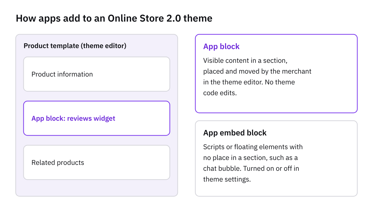
Reviews usually arrive through an app block or an app embed, so check how yours loads and what it adds to the page. A block sits where you place it in the theme editor. An embed loads across the store. Either can bring extra JavaScript that slows the page. The web.dev Web Vitals guide says Largest Contentful Paint should occur within 2.5 seconds of when the page first starts loading, and Cumulative Layout Shift should stay at 0.1 or less. A review widget that pops in late and pushes the add to cart button down can hurt the second one. Reserve space for it in your Liquid or CSS. The same guide says lab tools are not a substitute for field measurement, so check real visitors on real phones, not only a test run on your laptop.
Test mobile speed and stability
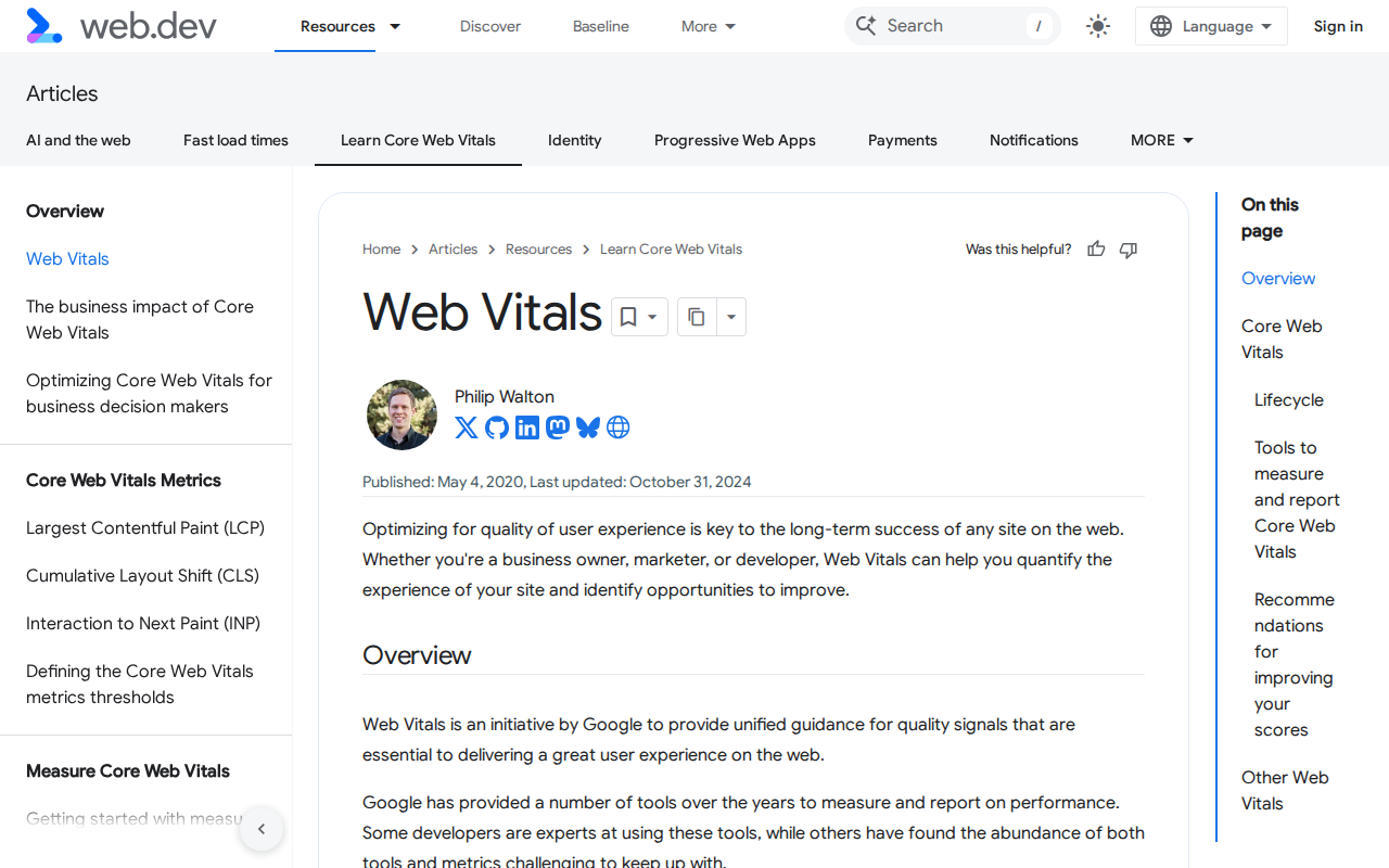
Start on a phone. Many shoppers browse that way, so a store that feels fine on your laptop can still feel slow in someone's hand. Judge it with the three Core Web Vitals. web.dev says Largest Contentful Paint (LCP), which measures loading, should occur within 2.5 seconds of when the page first starts loading. Interaction to Next Paint (INP), which measures how quickly the page responds to taps, should be 200 milliseconds or less. Cumulative Layout Shift (CLS), which measures visual stability, should be 0.1 or less. That last one matters on product pages, where a late-loading banner or review widget can push the add-to-cart button just as someone reaches for it.
Check your results the way web.dev suggests: look at the 75th percentile of page loads, segmented across mobile and desktop. Use real visitor data where you can, because web.dev says lab measurement is not a substitute for field measurement. Performance varies by device, network and what people actually do on the page. Lighthouse is still useful for quick checks, but it loads pages without a user, so it cannot measure INP. Total Blocking Time is the lab-measurable proxy for it, so use that when you test in Lighthouse.
If you're a developer, the web-vitals JavaScript library is described by web.dev as the easiest way to measure all the Core Web Vitals. Add it to the theme and send each result to your analytics, with the device type and page template attached. That lets you see whether the product page or the collection page is the weak spot on mobile. The usual pitfall is weight from apps and third-party scripts. Each one tends to add JavaScript that the phone has to download and run, which can hurt loading and responsiveness. Go through your installed apps, remove anything you don't use, and check that nothing is left behind in the theme code.
Walk through checkout, then decide what to fix
Place a test order on your own phone, start to finish, as a stranger would. Write down every point of friction as you go: costs that only appear late, a forced account before payment, a payment method your customers expect but can't find, and any step that feels slow. Use a real product, a real address and a small order you can refund. Doing it on mobile data rather than your office wifi tends to show you problems you'd otherwise miss.
Slow steps deserve a proper look, not a hunch. The web.dev guidance on Web Vitals says lab tools are not a substitute for field measurement, because performance varies by device, network conditions and user interaction. So treat your own test as one data point. If you want real numbers from real visitors, the web-vitals JavaScript library is described there as the easiest way to measure all the Core Web Vitals, and the same page strongly recommends setting up your own real-user monitoring.
Now rank what you found. Fix whatever blocks a purchase first: a missing payment method, a surprise cost, a broken step. Polish comes later. This tends to work because a blocker stops every buyer, while a cosmetic tweak only nudges some of them. Change one thing at a time, so when behaviour shifts you know which change did it.
On the build side, checkout changes on Shopify are mostly settings and approved extensions, not custom code. Before you write anything, check what the admin offers for shipping rates, payment methods and customer account options. Often the fix is a toggle, and that is cheaper to ship and easier to undo.
Get the weekly digest
One email every Monday: the week’s new guides and articles, plus the Shopify deadlines coming up and what’s been announced. Free, and you can unsubscribe in one click.
Sources
- Web Vitals | Articles | web.dev · web.dev · accessed 2 Nov 2026
AI-assisted, reviewed by Scott. Every claim is checked against the sources above.